Creating a design system with Unit4
Unit4 provides cutting-edge enterprise HR software to a global clientele of thousands of companies. They have a diverse range of products and had, when I was hired, a very immature design system in the early stages of development.
Snapshot
Led early-stage design development of the Unit4 Design System as Senior UX/UI Designer.
Introduced semantic design tokens, providing designers with clearer context and improving consistency.
Designed a suite of reusable components, prioritised through roadmap workshops with the Design System Lead.
Participated in moderated user testing to support user-centred design decisions.
Improved cross-team collaboration and efficiency through the adoption of the Design System.
Problem
The Unit4 design system was still in its early stages, lacking structure and requiring additional expertise. Enhancements were needed to improve the adoption of the design system, ensuring greater usage among UX Designers and a more streamlined design process.
Business goals
Foster Team Collaboration
Bring teams together through collaboration and unity between the design and engineering teams, ensuring alignment in goals and direction.
Establish Design Consistency
Achieve design consistency across all products by unifying design principles and standards.
Improve workflow efficiency
Improve workflow efficiency among teams, with a particular focus on the design system team taking the lead in driving and optimizing collaborative processes.
My role
Initially, my role as a senior designer centered on crafting tokens and components. However, the initiative to establish and integrate the design system across the entire business meant expanded responsibilities. This included taking on leadership responsibilities for the design team, conducting surveys with UX designers, creating roadmaps, organising retrospectives, and collaborating closely with both engineering and content teams.
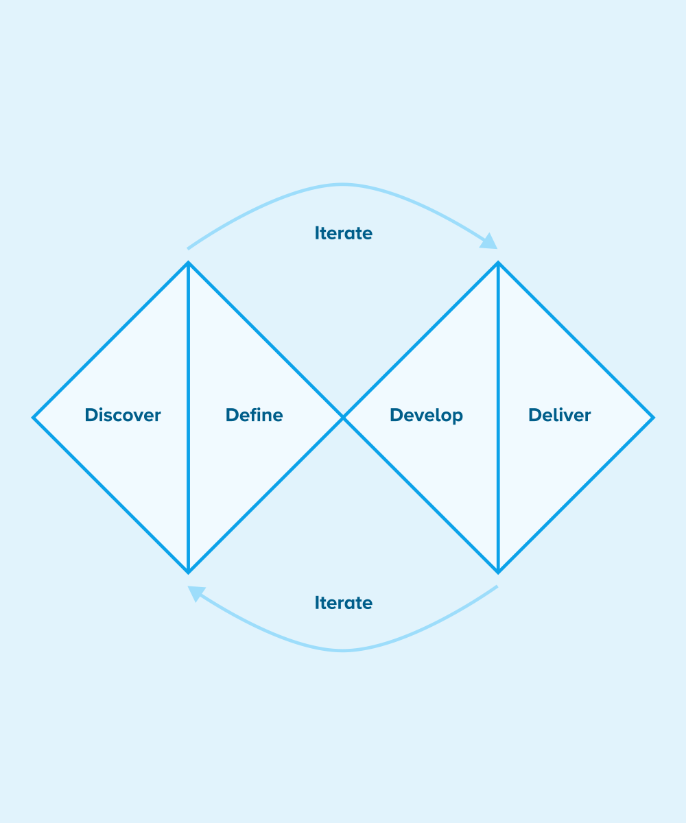
The double diamond UX design process. Image and text source: www.designcouncil.org.uk
Design strategy
The Double Diamond is a visual representation of the design and innovation process. It’s a simple way to describe the steps taken in any design and innovation project, irrespective of methods and tools used.
Discover
The first diamond helps people understand, rather than simply assume, what the problem is. It involves speaking to and spending time with people who are affected by the issues.
Define
The insight gathered from the discovery phase can help you to define the challenge in a different way.
Develop
The second diamond encourages people to give different answers to the clearly defined problem, seeking inspiration from elsewhere and co-designing with a range of different people.
Deliver
Delivery involves testing out different solutions at small-scale, rejecting those that will not work and improving the ones that will.
Product and token audit
The first task involved auditing the existing design tokens within Unit4, using the extensive product suite and ongoing rebranding efforts. This required proactive engagement with diverse teams across the organisation to gather insights into their ongoing projects.
With the completion of the design tokens audit, the focus shifted to evaluating the designs generated by the UX team. This analysis aimed to identify common patterns and ascertain where the existing design tokens were actively applied. It provided crucial insights into the necessity for introducing new design tokens to address evolving design requirements.

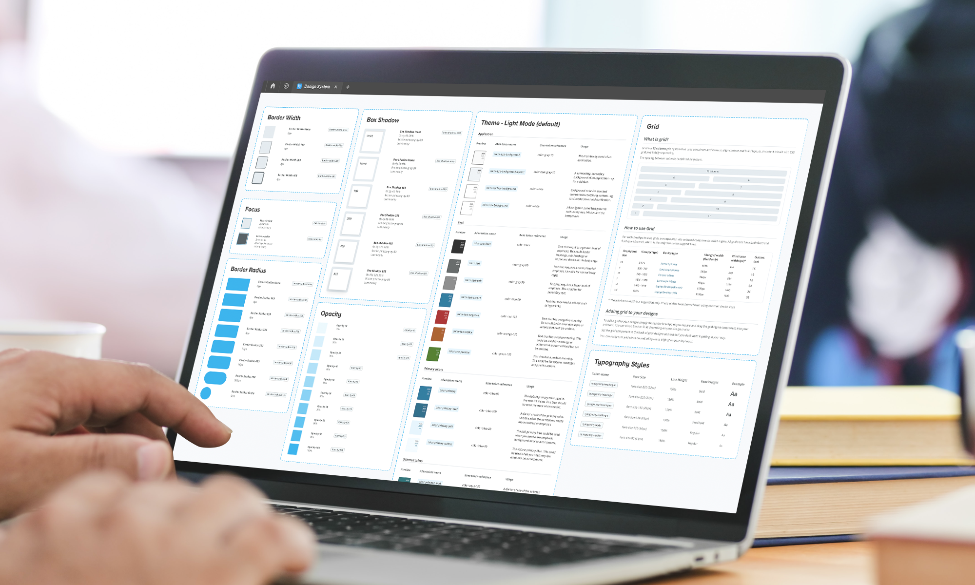
A glimpse of some of the files used for product and token audit
Designing design tokens
Once the comprehensive evaluation was achieved, I could see which design tokens could be developed first.
Given that design work was still in progress, this became an ongoing and iterative process. Leveraging Figma as my primary design tool, I recognized the need to establish a more detailed and efficient design process. To enhance results within a reasonable timeframe, I introduced a more structured approach, dividing the research phase into two distinct sections: internal research and external research.
This was the baseline process for all design tokens.
Internal Research
In the internal research phase, the focus was on examining designs across the product suite and engaging in discussions with UX designers to understand their future design roadmaps.
External Research
External research involved studying other design systems to draw inspiration. Key questions included identifying patterns, exploring industry standards, and comparing these external tokens with our own.
Token Development
With the research phase solidified, I shared my initial findings with design system stakeholders and peers. Good feedback paved the way for further development and the design phase of the tokens. The approach varied based on the token type, incorporating insights from previous discoveries and patterns within the Unit4 UI.
Iterative Collaboration
The process remained highly iterative, involving input from diverse teams, including content and engineering. This collaborative effort ensured a comprehensive and well-rounded approach to token development, aligning with the evolving needs and accessibility standards.
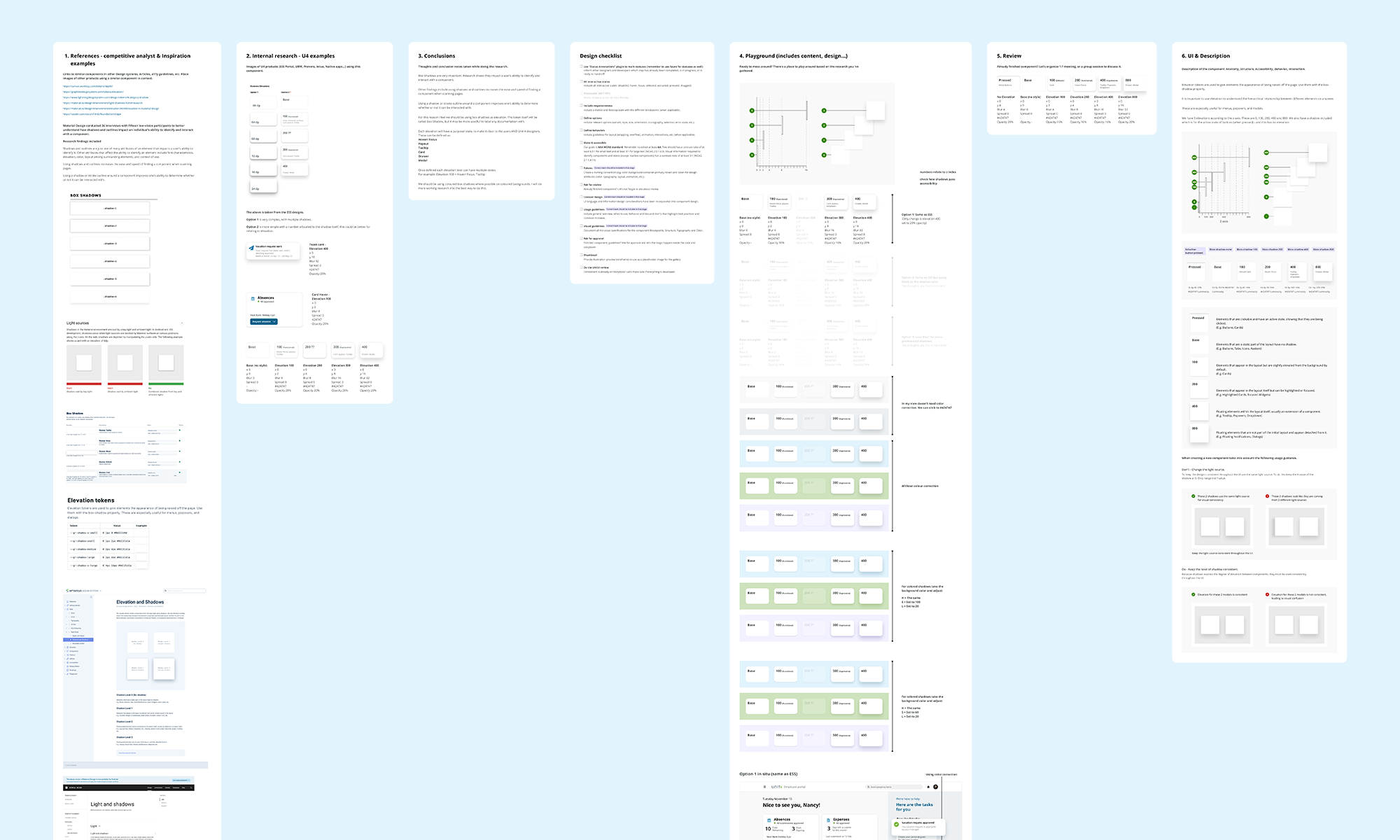
An example of the design process for tokens. This includes research, conclusions, design playground, iterations, final UI and documentation.
The outcome
The result of this process was the creation of a comprehensive suite of design tokens that served as the foundation for early component designs. Regular releases facilitated the helped share these tokens with other teams. This ensured that all relevant information was readily available to teams working on the design of new components, promoting consistency and collaboration across various projects.
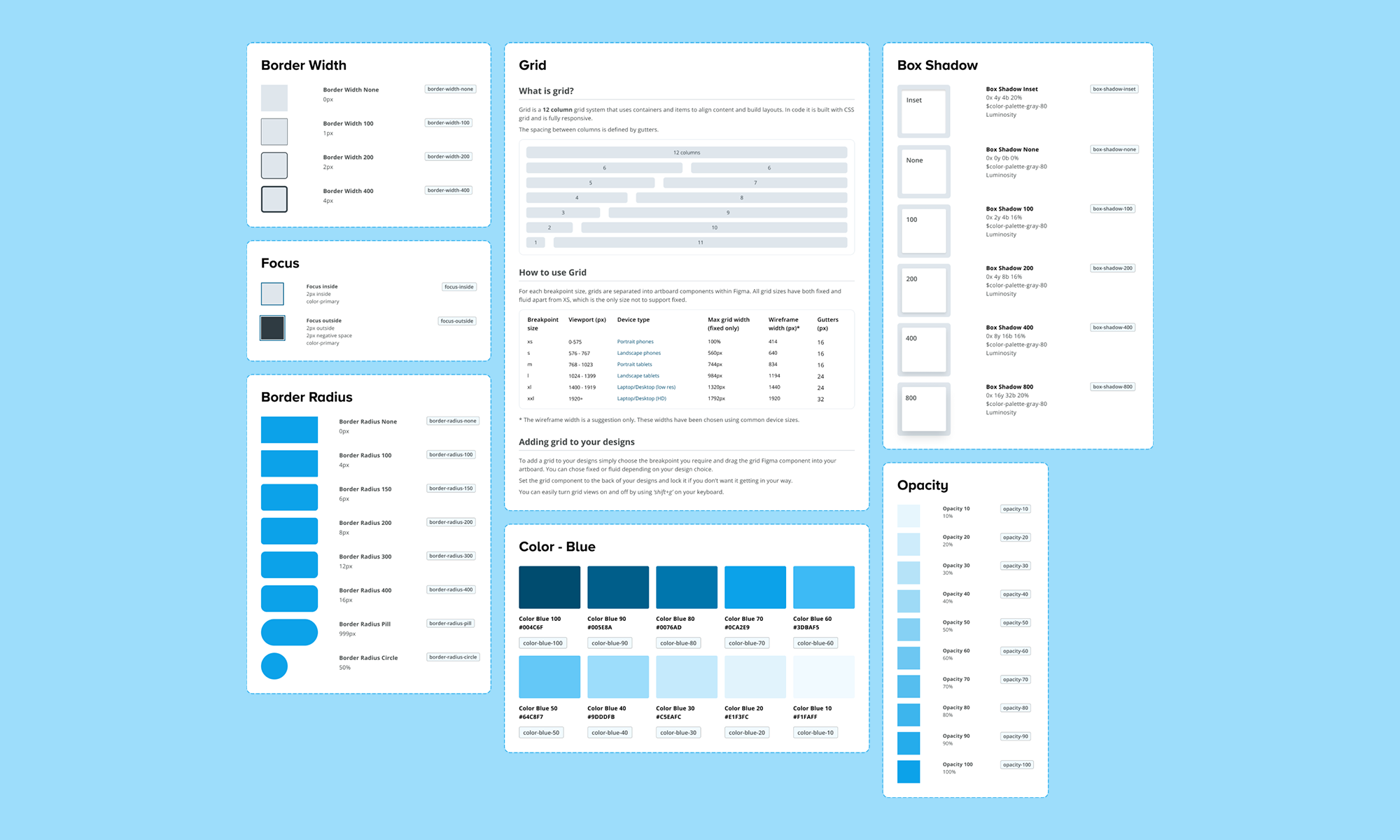
A range of base design tokens in the design system.
Introducing alias tokens
In order to input more semantic meaning into certain tokens, particularly those related to typography and colors, I introduced Alias tokens. These Alias tokens served to define the specific purpose that a base token fulfilled in the UI. For instance, a color token named 'blue-90' could be transformed into an Alias token called 'primary-loud.'
Color
While we had an extensive list of color tokens for designing various products, there was a challenge in tracking changes if they occurred. To address this, in collaboration with the design systems manager, I introduced alias color tokens to add semantic meaning to the color palette. It became evident that one color token could serve multiple purposes; for instance, 'blue-90' could be both 'primary-button' and 'primary-loud.' Additionally, we introduced alias color tokens for statuses, building upon the color tokens to provide consistent options for UX designers.
Typography
For typography, the goal was to establish base typography tokens that would expand the design options for designers while also imposing some restrictions. To achieve this, we introduced base typography tokens 'font-size,' 'line-height,' and 'font-weight.' These base tokens could then be combined to create typography styles, forming another category of alias tokens.
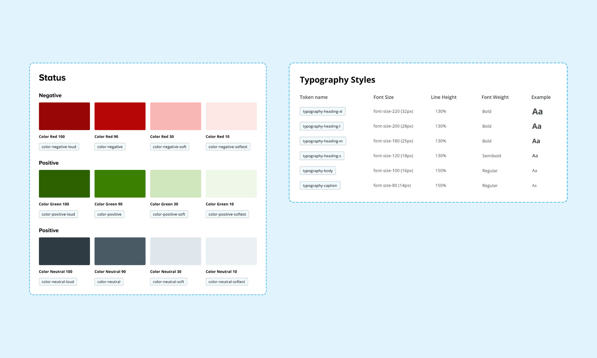
The status and typography alias tokens.
Components
Armed with a comprehensive suite of tokens and alias tokens, I used these as a foundation to commence the design of the initial components. To streamline this process, prioritisation of components was crucial, requiring collaboration with the design and engineering teams.
UI Component Audit
Collaborating with the UX director and the design system manager, we conducted an audit of ongoing product projects. This audit not only helped identify the most crucial and frequently used components but also facilitated the prioritisation process. By aligning with projects having urgent timelines, we could determine the priority of component development.
Design System Roadmap
Utilizing Miro, the design systems manager and I crafted a roadmap outlining the timeline for the development of essential components. This exercise provided a visual representation that aided in distinguishing between crucial and less critical components, allowing for a strategic and organised approach to component design and implementation.
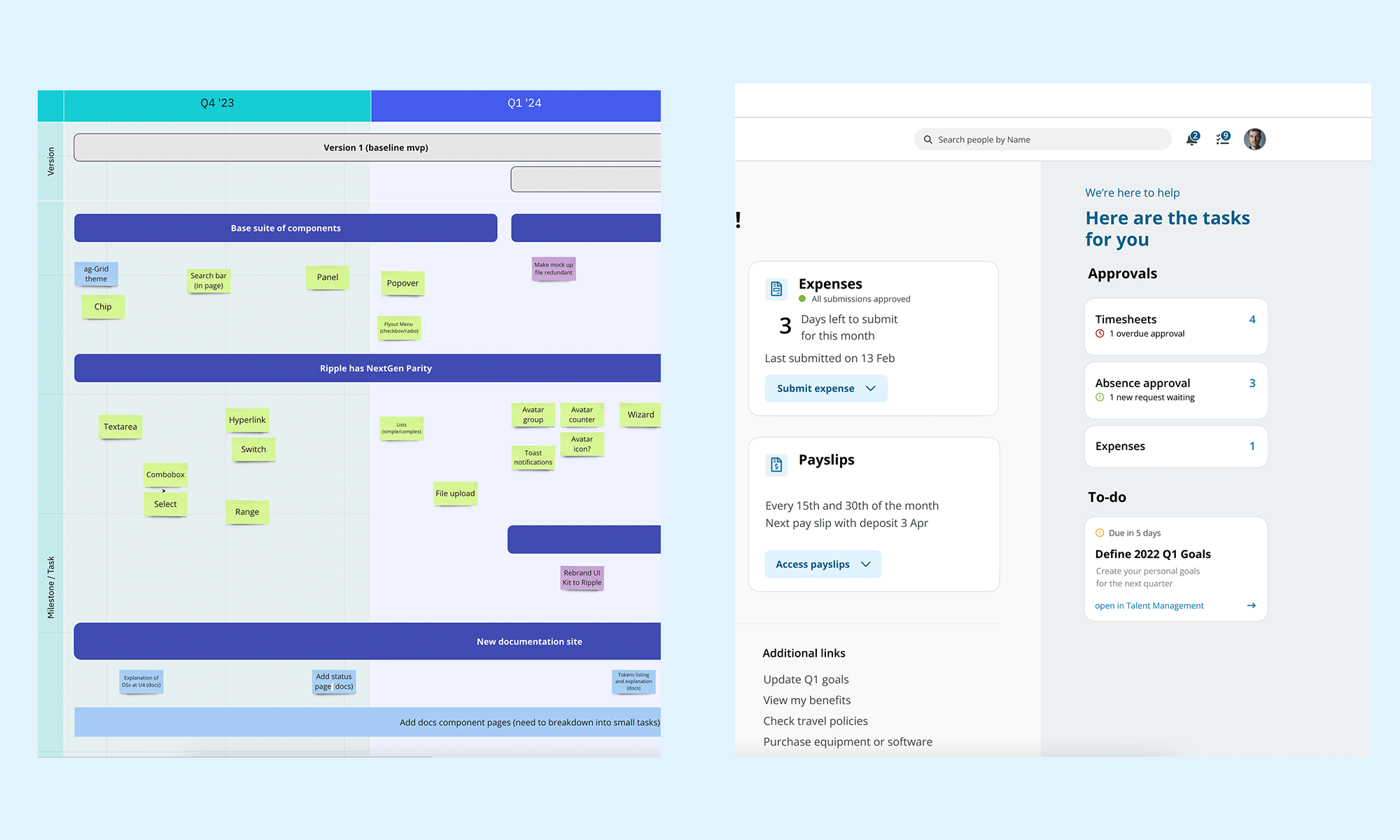
Left: the component road map using Miro. Right: an example screen taking in examples of components.
Component considerations
During the design process of the components, several considerations and design specifics were taken into account to ensure a cohesive and functional design system.
Use of Design Tokens
Design tokens were used throughout the components, providing a consistent and efficient way to make design decisions across various elements. This was particularly beneficial in maintaining uniformity, for instance, in determining the color of negative statuses across multiple components.
Accessibility
Ensuring accessibility was a paramount concern throughout the design system. This meant considerations such as color contrast, non-text image contrast, focus states, and keyboard navigation. All components were carefully crafted to be accessible and user-friendly.
Component Properties within Figma
To facilitate a seamless transition from design to development, each Figma component was designed with various properties, including size, color, variants, interaction states, and placement. These properties were not only documented but also labeled within the Figma components themselves. The challenge here was to create a suite of components sharing similar properties where applicable, requiring a systemic approach from the outset.
Figma's Advanced Variants Features
Figma's advanced variants features played a pivotal role in ensuring that the components were not only usable and repeatable but also aligned with engineering standards. This approach enabled a smoother collaboration between design and engineering.
Stakeholder Feedback
Throughout the design process, feedback from stakeholders, UX designers, and the content team was actively sought. This iterative feedback loop helped refine the components, ensuring they met the diverse needs and expectations of all involved parties.
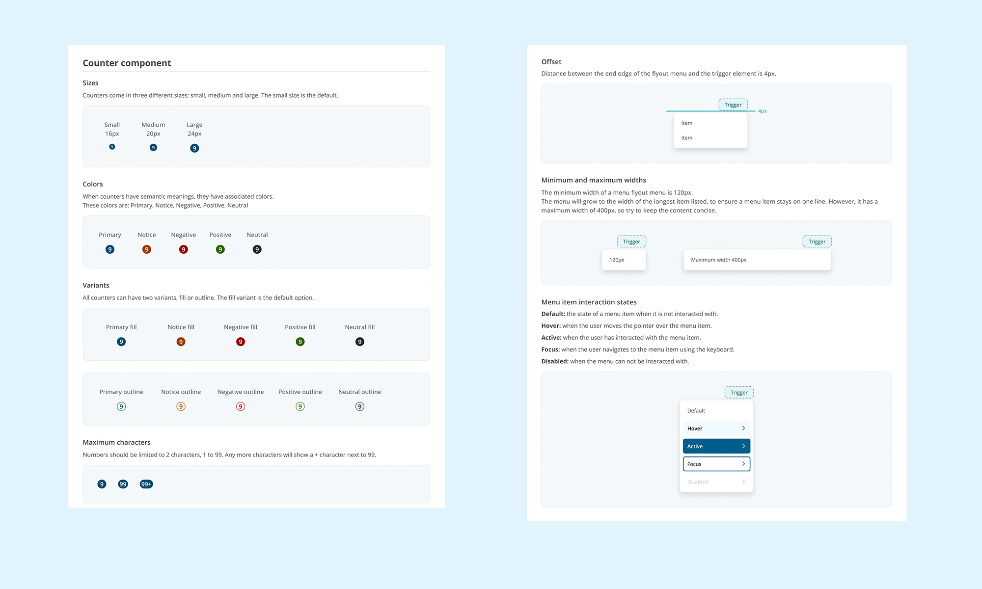
Examples of component properties including interaction states.
The outcome
The result of the design effort is a cohesive collection of components within the design system. These components share design tokens and exhibit similar interaction states, promoting consistency and efficiency in design and development.
As of now, the design system boasts a library comprising 25 Figma components, with a significant portion of them already implemented in React by the engineering team. This integration of design and development efforts underlines the system's effectiveness in translating design concepts into functional, reusable components.
The design system has proven to be a unifying force across diverse products and teams. By instilling a mindset of systems thinking from the project's inception, it has successfully streamlined design and development processes, contributing to notable reductions in time and effort across the board.
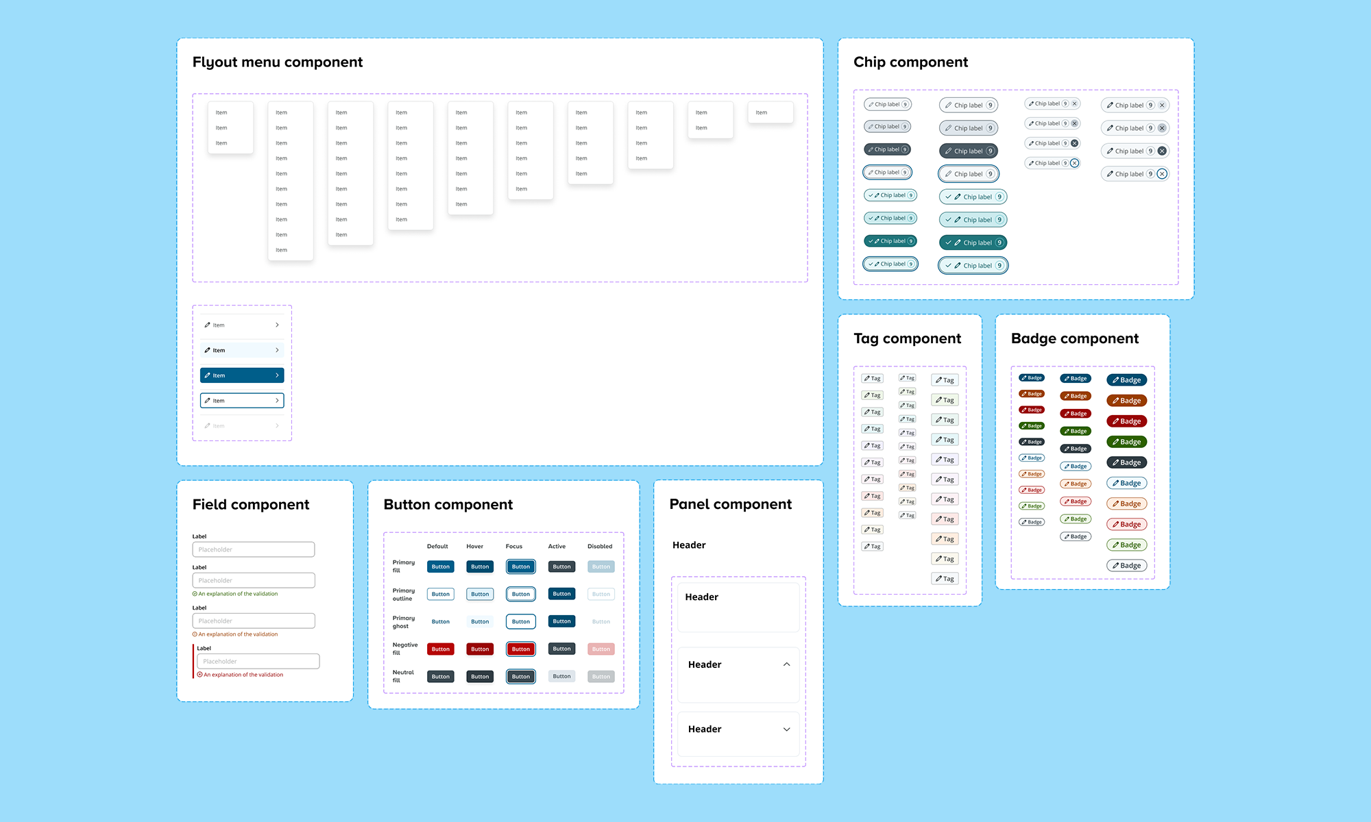
A range of components within the UI library.

Selected designs created with the Unit4 design system.

“Alister has gone above and beyond to showcase a high level of work and leadership to UX team, through his willingness to learn and question, his thirst for knowledge as well as his positive attitude.”
Sam Wood, Senior UX Engineer